
Why So Many AI Products Look Exactly the Same
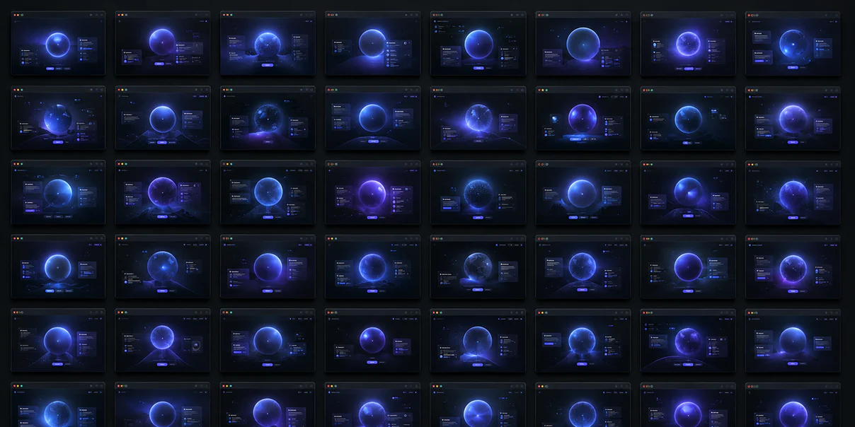
The visual cost of designing from the same models, component libraries, and references.
Take ten AI startups you’ve never seen before. Open each website in a new tab. Without reading a single headline, try to guess which company is which.
You’ll probably struggle.
The interfaces blur together. Dark backgrounds. Electric blue gradients. Purple glows. Floating glass cards. Rounded corners. Abstract 3D spheres. Wireframe meshes. Tiny glowing particles. Dashboard screenshots with identical layouts. Illustrations of robots, brains, or orbiting nodes. A hero headline about “reimagining the future.”
It has become surprisingly difficult to distinguish one AI company from another — not because they’re solving the same problems, but because they’re expressing those solutions in nearly identical ways.
Ironically, we’re living through one of the most transformative periods in technology while simultaneously experiencing one of the most visually repetitive eras in digital design.
The tools that have made creation more accessible have also made sameness easier than ever.
The result isn’t bad design. Much of it is technically excellent. It’s simply becoming indistinguishable.
As visual designers, we should pay attention to that. Because when every interface looks familiar before someone has even read the first sentence, visual identity stops becoming a competitive advantage. It becomes visual wallpaper.
The next generation of exceptional AI products won’t stand apart because they have better gradients or shinier interfaces. They’ll stand apart because they have a clearer point of view.
AI Is Learning From AI
One of the most fascinating things about modern design tools is where they learn.
Generative models are trained on enormous collections of existing work. Designers themselves gather inspiration from products they admire. Teams reference successful startups. Component libraries borrow patterns from industry leaders. Templates spread quickly across communities.
Eventually something interesting happens. The references begin referencing each other. Design starts becoming recursive.
Today’s AI interfaces are often influenced by yesterday’s AI interfaces, which themselves were influenced by another generation of products. Every iteration becomes slightly more refined. But also slightly more similar.
This isn’t anyone’s fault. It’s simply how patterns spread.
Good Patterns Become Default Patterns
Design systems exist for a reason. Component libraries solve real problems.
Buttons should feel familiar. Navigation should be understandable. Forms should be predictable. Consistency improves usability. There’s tremendous value in shared conventions.
The problem begins when conventions become complete visual identities.
Users don’t remember your company because your buttons had a twelve-pixel radius. They remember because your product made them feel something distinctive.
Frameworks should create consistency. They shouldn’t eliminate personality.
Dark Mode Became an Entire Industry
There was a time when dark interfaces felt fresh. Sophisticated. Technical. Premium. They communicated innovation because relatively few products used them.
Today, entire categories have adopted nearly identical visual language. Dark charcoal backgrounds. Blue highlights. Purple accents. Soft glows. Glass panels. Tiny dots connected by lines.
The result is a strange contradiction. Products trying to communicate innovation increasingly look conventional.
Color itself isn’t the issue. Context is. When everyone adopts the same palette, the palette stops communicating differentiation.
The Glowing Orb Problem
If you’ve spent time browsing AI company websites, you’ve probably seen it. The glowing sphere.
Sometimes it’s floating. Sometimes it pulses. Sometimes it contains particles. Sometimes it’s surrounded by gradients. Occasionally it becomes a swirling neural network.
It’s beautiful. It’s also becoming one of the most recognizable clichés in AI branding.
Why? Because abstract intelligence is difficult to visualize. A glowing object becomes a convenient metaphor for complexity.
But when everyone reaches for the same metaphor, the metaphor loses meaning.
Dashboards Started Looking Like Dashboards
Open ten SaaS products. The dashboards often share remarkably similar structures. Sidebar. Cards. Charts. Metrics. Activity feed. Profile avatar. Search. Notifications.
This isn’t inherently wrong. Users benefit from familiar organizational patterns.
The challenge appears when every product communicates itself through exactly the same composition. Eventually users stop seeing the product. They see another dashboard.
The interface explains functionality. It stops expressing identity.
Components Don’t Create Brands
Modern component libraries are extraordinary. They’re accessible. Flexible. Well engineered. Consistent. They’ve dramatically improved interface quality across the industry.
But components aren’t brands.
Two companies can use identical design systems while communicating completely different personalities. Or unfortunately, the exact same personality.
Brand doesn’t emerge from components. It emerges from decisions. Typography. Photography. Motion. Language. Rhythm. Composition. Illustration. Spacing. Hierarchy.
Those choices remain deeply human.
Sameness Feels Safe
There’s a reason teams gravitate toward familiar aesthetics. Familiarity reduces perceived risk.
If Stripe uses this style. If Linear uses this interaction. If OpenAI uses this visual language. Surely we’re making good decisions.
Sometimes that’s true. Sometimes we’re borrowing confidence rather than building it.
Design references are valuable. Copying reference aesthetics without understanding why they worked rarely is.
AI Rewards Average
Generative systems excel at finding patterns. That’s their strength.
Ask for “a premium SaaS homepage.” You’ll likely receive something remarkably competent. Also remarkably familiar.
AI predicts probability. Taste often requires improbability.
The memorable solution isn’t always statistically likely. Sometimes it emerges because someone intentionally rejected the obvious direction.
Original Doesn’t Mean Strange
Designers occasionally react against sameness by becoming intentionally unconventional. That’s another trap.
Originality isn’t random. Originality serves meaning.
A healthcare company shouldn’t suddenly look like a music festival simply to avoid visual similarity.
The question isn’t “How can we be different?” The better question is “What honestly reflects who we are?”
Authenticity creates distinction naturally. Artificial uniqueness rarely lasts.
Brand Lives in Details
When I think about memorable digital brands, I rarely remember isolated components. I remember feelings.
Linear feels calm. Notion feels thoughtful. Apple feels intentional. Patagonia feels principled. Airbnb feels welcoming.
Those emotional responses emerge from thousands of small decisions working together.
Brand isn’t one hero illustration. It’s behavioral consistency.
Typography Is Becoming a Differentiator Again
As visual structures become increasingly standardized, typography quietly becomes more important.
Letterforms carry personality. Spacing creates rhythm. Scale communicates confidence. Editorial layouts create atmosphere.
Typography remains one of the richest opportunities for distinctive visual identity because it isn’t merely decoration. It’s communication.
The best brands increasingly sound unique before they even become visually unique.
Photography Feels Human Again
Another encouraging trend is the return of real photography. Not polished stock imagery. Real teams. Real products. Real moments. Real craftsmanship.
In a world filled with generated visuals, authentic photography suddenly feels distinctive. Imperfection becomes memorable. Reality becomes premium. Humanity becomes brand.
Motion Needs Meaning
Animation has followed a similar trajectory. Micro-interactions became smoother. Transitions became more refined. Everything moves beautifully.
Sometimes beautifully without purpose.
When every panel glides dramatically across the screen, motion stops communicating. It becomes decoration.
Purposeful movement remains memorable. Constant movement becomes invisible.
AI Products Need More Humanity
One irony of artificial intelligence is that it often encourages companies to become less human visually.
Products talk about models. Agents. Automation. Inference. Reasoning. Pipelines. Infrastructure.
Users think about something entirely different. Their work. Their stress. Their deadlines. Their customers. Their ambitions.
The strongest AI brands increasingly won’t visualize intelligence. They’ll visualize people becoming more capable.
That’s a fundamentally different story.
Your Product Isn’t Your Category
Too many products accidentally design themselves around their industry instead of their identity.
AI companies look like AI companies. Banks look like banks. Healthcare platforms look like healthcare platforms. Education products resemble education products.
Categories create expectations. They shouldn’t eliminate personality.
Your customer didn’t choose you because you belong to a category. They chose you because you solve their problem differently. Your visual identity should communicate that distinction.
The New Luxury Is Restraint
Interestingly, one of the strongest reactions against AI sameness isn’t becoming louder. It’s becoming quieter.
More whitespace. Better typography. Fewer colors. Intentional photography. Simpler motion. Thoughtful pacing.
Confidence increasingly looks restrained. The louder visual language becomes across the industry, the more premium restraint feels.
Design Needs Opinions Again
One consequence of optimizing for best practices is that interfaces become increasingly agreeable. Everything feels professionally designed. Nothing feels particularly authored.
Great creative work usually contains opinions. About hierarchy. Language. Photography. Composition. Interaction. Rhythm.
Taste reveals itself through choices. Not consensus.
CMSs Can Either Help or Hurt Distinction
Enterprise platforms like Sitecore and Optimizely often get blamed for generic websites. In reality, the platform isn’t the problem. The implementation is.
A thoughtfully designed component system can express a unique brand beautifully while remaining flexible for content authors. A poorly designed component library can make every page feel like a template regardless of the underlying technology.
The goal isn’t to create unlimited flexibility. It’s to create meaningful flexibility. Give authors room to tell stories without allowing the experience to drift into visual inconsistency.
The best CMS implementations don’t produce identical pages. They produce unmistakably recognizable ones.
AI Won’t Replace Art Direction
One question I hear frequently is whether AI will replace visual designers. I think it’s replacing a different part of the job.
Production is becoming easier. Art direction is becoming harder.
Generating one image isn’t difficult anymore. Creating an entire visual world is. Maintaining consistency across hundreds of touchpoints is. Building a recognizable aesthetic over years is.
Making every illustration, photograph, animation, interface, and interaction feel like it belongs to the same company — that remains profoundly human work.
The future designer may spend less time drawing individual assets and far more time shaping the creative system those assets belong to.
Taste Creates Distance
As execution becomes increasingly democratized, something interesting happens. The gap between average work and competent work shrinks. The gap between competent work and exceptional work becomes larger.
Why? Because exceptional work depends less on execution and more on judgment.
Choosing restraint. Choosing authenticity. Choosing clarity. Choosing humanity. Choosing not to follow every trend.
Taste creates distance where software creates similarity.
At Artifact, We Design Identity Before Interfaces
At Artifact, we believe visual design begins before color palettes or component libraries. It begins with understanding.
Who is this company? What does it believe? What emotion should people feel? How should the product behave? What kind of confidence should it communicate?
Only then do we begin making visual decisions.
Because if identity isn’t clear, the interface eventually borrows someone else’s.
That’s how visual sameness spreads. Not through poor design. Through absent perspective.
The Future Will Belong to Distinctive Brands
Artificial intelligence will continue making exceptional execution easier. Layouts will improve. Code generation will improve. Illustration quality will improve. Motion design will improve. Everyone’s baseline quality will rise.
That’s wonderful. But rising quality alone doesn’t create memorability.
People remember products that feel different because they are different. Not louder. Not stranger. Not trendier. More authentic. More intentional. More human.
The next generation of great AI companies won’t distinguish themselves through another glowing orb floating over another dark gradient. They’ll distinguish themselves through a perspective that no model can invent for them.
Because while AI can generate almost any visual language, it still cannot decide who you are.
That’s the work of design. And that work has never been more valuable.