
Motion Should Guide, Not Distract
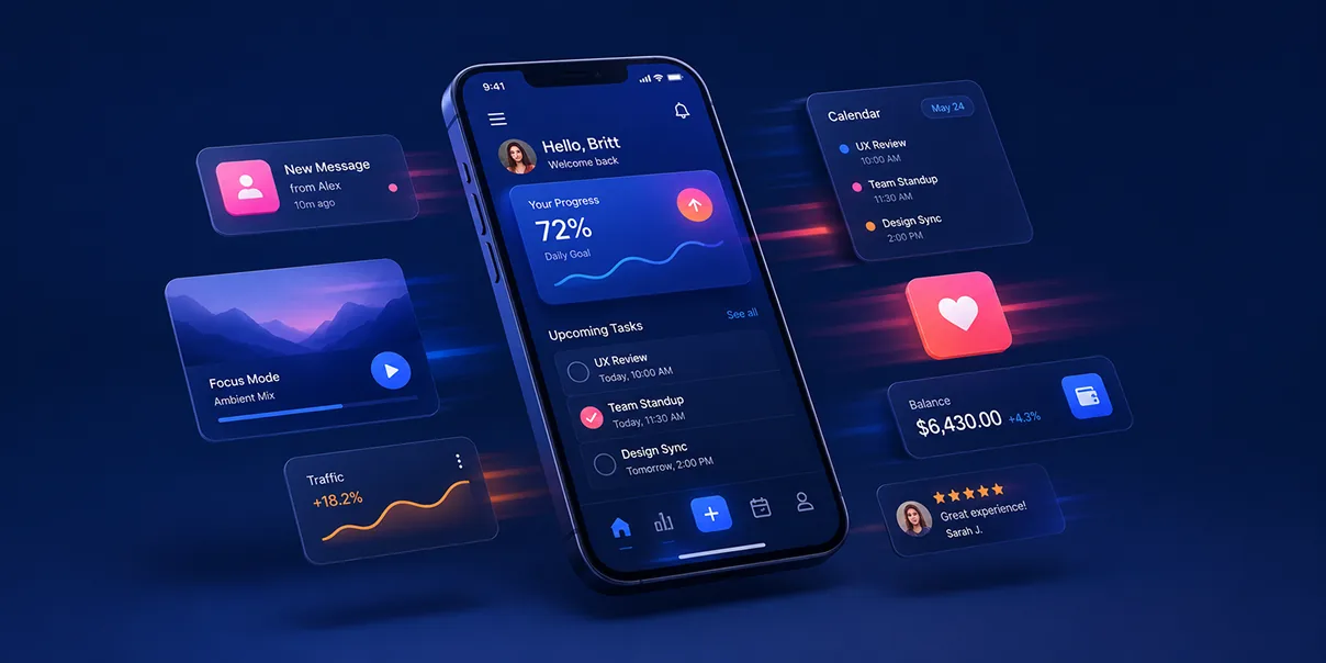
Using animation to improve understanding rather than impress.
There was a period in digital design when motion felt like magic.
Buttons bounced. Cards flipped. Menus flew across the screen. Everything faded, scaled, blurred, rotated, and animated in ways we’d never seen before.
It was exciting.
For the first time, interfaces felt alive.
But somewhere along the way, many of us confused movement with meaning.
We started animating because we could — not because we should.
Today, creating beautiful motion is easier than ever. Modern browsers handle complex animations effortlessly. Design tools prototype interactions in minutes. AI can generate polished transitions before you’ve even finished describing them.
Yet the question hasn’t changed.
Does this animation help someone understand what’s happening?
If the answer is no, it probably doesn’t belong.
Because great motion isn’t decoration.
It’s communication.
Motion Is Part of the Interface
People often think of animation as something layered on top of design. Almost like frosting on a cake.
The interface already exists. Motion simply makes it prettier.
I don’t see it that way.
Motion is part of the interface itself.
It teaches. Explains. Confirms. Connects. Reassures.
It tells users where something came from. Where it’s going. Why it changed.
Without motion, interfaces often feel disconnected.
With thoughtful motion, they feel understandable.
The Real Job of Motion
Every animation should answer a question.
What just happened? Where did this panel come from? What changed? Did my action succeed? Is the system working? Can I interact yet?
Those questions create uncertainty.
Motion removes uncertainty.
That’s why I believe the best animations often go unnoticed. Users don’t admire them. They simply understand the experience more easily.
Movement Creates Mental Models
One of the remarkable things about human perception is how quickly we understand physical movement.
We’ve spent our entire lives observing objects moving through space. When digital interfaces borrow those same expectations, people learn faster.
Imagine opening a navigation drawer.
If it suddenly appears without context, users briefly need to reorient themselves. If it slides naturally from the edge of the screen, the relationship becomes obvious. It feels connected.
Motion builds mental models.
Users begin understanding how the interface is organized because movement reinforces structure.
Good Motion Reduces Cognitive Load
Animation is often associated with adding complexity.
In reality, thoughtful motion does the opposite. It reduces the amount of thinking required.
Consider a loading state.
A blank screen creates uncertainty. A subtle progress indicator communicates: “The system heard you.” “We’re working.” “Please wait.”
Nothing about the underlying technology changed.
Only the user’s confidence changed.
That’s the power of motion.
Motion Should Reward, Not Interrupt
One mistake I see frequently is using animation to demand attention.
Large transitions. Long delays. Dramatic entrances. Everything competing to be noticed.
The problem is that users didn’t come to admire animations. They came to accomplish something.
Motion should reward interaction. Not interrupt it.
A button confirming submission. A card expanding to reveal details. A list gracefully reorganizing after filtering.
These interactions support the task instead of delaying it.
Every Millisecond Matters
Timing is one of the least discussed aspects of visual design.
An animation that’s too fast feels abrupt. One that’s too slow feels frustrating.
Somewhere in between lies something interesting. Natural movement.
Interfaces should respond quickly enough to feel immediate while remaining slow enough for people to perceive what changed.
That balance creates confidence.
People don’t simply see movement. They understand it.
Motion Creates Continuity
Digital products rarely consist of isolated screens anymore.
Users move through systems. Dashboards. Workflows. Multi-step forms. Complex applications.
Motion helps these experiences feel connected.
Instead of teleporting between unrelated states, users experience continuity. One screen evolves into another. One object transforms into the next. Relationships become visible.
Continuity reduces disorientation.
Animation Isn’t Entertainment
This may sound obvious.
Yet many interfaces still behave as though they’re performing.
Buttons bounce unnecessarily. Icons spin forever. Elements float without purpose. Backgrounds pulse constantly.
Movement attracts attention. Too much movement steals it.
Animation should never compete with the content it’s supporting.
Its purpose is guidance. Not performance.
The Best Motion Feels Physical
Good animation respects the way people intuitively understand movement.
Objects accelerate. They slow down. They carry momentum. They settle naturally.
Digital interfaces don’t need to obey physics perfectly. But borrowing from the physical world makes interactions feel believable.
Believability creates trust.
Motion Establishes Hierarchy
Just like typography and spacing, animation influences hierarchy.
Primary actions can feel more deliberate. Supporting elements can fade quietly into place. Notifications can appear without demanding unnecessary attention.
Not everything deserves the same amount of movement.
Hierarchy isn’t only visual. It’s temporal. The order in which things appear teaches users what’s important.
AI Won’t Replace Judgment
Artificial intelligence can already generate beautiful animations. Transitions. Microinteractions. Loading states. Interactive prototypes.
That’s incredible.
But beautiful isn’t the same as useful.
AI can suggest movement. Designers still determine meaning.
Should this move? Should it wait? Should it disappear? Should it transform?
Those are experience decisions. Not technical ones.
Accessibility Matters
Thoughtful motion also considers people who experience movement differently.
Some users are sensitive to excessive animation. Others rely on predictable transitions to understand interface changes.
Respecting system preferences such as reduced motion isn’t simply an accessibility feature. It’s good design.
Design isn’t about creating one ideal experience. It’s about creating experiences that adapt to real people.
Less Motion Often Feels More Premium
Luxury brands understand restraint. The same principle applies to digital products.
Confident interfaces rarely overperform.
A subtle fade. A gentle transition. A carefully timed expansion.
Motion doesn’t need to shout.
When every interaction moves dramatically, nothing feels special.
Restraint creates sophistication.
Designing the Invisible
One of my favorite things about motion design is that success often goes unnoticed.
Users rarely say, “I loved the easing curve.” They say, “That felt smooth.” “It was intuitive.” “It made sense.”
Those reactions aren’t accidents. They’re the result of dozens of invisible decisions.
Craft isn’t always what users notice. It’s what they no longer have to think about.
Motion Is Emotional
Animation influences emotion just as much as function.
Abrupt movement creates urgency. Gentle movement creates calm. Playful motion creates delight. Precise motion creates confidence.
Every interaction communicates personality. Not through words. Through behavior.
Digital products don’t simply look a certain way. They behave a certain way.
That behavior becomes part of the brand.
Designing for Understanding
Whenever I review motion, I try to ask one simple question.
If we removed this animation entirely… would users understand less?
If the answer is yes, the motion is probably doing meaningful work.
If the answer is no, we should seriously consider removing it.
Every animation carries a cost. Performance. Attention. Complexity. Maintenance.
It should earn its place just like every other design decision.
Motion Is About Trust
Ultimately, thoughtful animation creates confidence.
Users trust interfaces that respond predictably. They trust products that acknowledge their actions. They trust systems that explain change instead of hiding it.
Motion becomes another layer of communication.
Quiet. Intentional. Supportive. Almost invisible.
That’s exactly where it should be.
Guide, Don’t Perform
As our tools continue improving, we’ll have more opportunities than ever to create visually impressive experiences.
That’s exciting.
But impressive shouldn’t become the goal. Understanding should.
Because users don’t remember products that moved the most. They remember products that felt effortless. The ones that made complex tasks feel simple. The ones that quietly guided them from uncertainty to confidence.
At Artifact, that’s how we think about motion.
Not as decoration. Not as entertainment. Not as proof of technical capability.
But as another design material. One that, when used with intention, helps people understand what words alone never could.
The best motion doesn’t ask users to stop and admire it.
It helps them move forward without ever needing to think about it.
And that’s exactly what great design should do.