
If We Can't See What's Happening, We Can't Change It
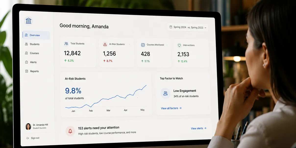
The next generation of higher education technology won’t be defined by how much data it collects. It will be defined by how clearly it helps people understand what matters.
As a visual designer, I spend a lot of time thinking about something that sounds simple:
What does someone need to see?
Not what information can we put on the screen. Not how many features can we fit into an interface. Not how impressive we can make a dashboard look.
What does this person need to see, right now, to understand what is happening and know what to do next?
That distinction matters.
Good visual design isn’t decoration. It is a way of making complexity understandable.
And as I’ve become increasingly involved in Artifact Digital’s work around the future of higher education, I’ve started to believe that this may be one of the most important design challenges universities face.
Higher education doesn’t have a shortage of information. Universities generate enormous amounts of it.
Grades. Assignments. Attendance. Course activity. Enrollment information. Advising interactions. Student communications. Surveys. Program data. Institutional research. Alumni engagement. And countless other signals created as students, professors, teaching assistants, administrators, families, and alumni interact with the institution.
The challenge is that information isn’t the same thing as understanding.
A university can possess enormous amounts of data and still struggle to see what is happening.
At Artifact Digital, we’ve been thinking about the relationship between people, digital experiences, behavior, information, and intelligent technology in different forms since 2019. Today, we’re applying that thinking to something we call a Predictive Learning Platform, or PLP.
There are parts of how we’re approaching it that we’re intentionally not discussing publicly yet. But the idea behind it is easy to understand:
What if universities could see meaningful patterns developing across the learning experience early enough for people to do something about them?
For me, that’s a visual design problem as much as it is a technology problem.
Because prediction has very little value if nobody understands what it’s trying to tell them.
More Data Is Not the Same as More Clarity
We’ve all seen dashboards that technically contain everything you could possibly want to know.
Charts. Graphs. Percentages. Tables. Filters. Trend lines. Color-coded indicators. Thirty different metrics competing for attention.
From a data perspective, the dashboard may be comprehensive. From a human perspective, it can be almost useless.
The person looking at it has to figure out: What matters? What changed? Is this good or bad? Should I be concerned? Is something unusual happening? What requires my attention? What can wait? What should I do next?
That’s where design becomes important.
The purpose of information design isn’t to display data. It’s to create understanding.
That distinction becomes even more important when we’re talking about predictive systems.
If artificial intelligence can identify thousands of patterns but the people responsible for students can’t understand those patterns, we haven’t solved the problem. We’ve just created another layer of complexity.
Design Is the Translation Layer
I think of visual design as a translation layer between complexity and human understanding.
The underlying system might be incredibly sophisticated. The person using it shouldn’t have to understand that sophistication.
Think about driving a car. Modern vehicles are processing enormous amounts of information constantly. Engine conditions. Speed. Temperature. Fuel. Tire pressure. Sensors. Navigation. Traffic. Cameras. Collision detection.
Most drivers don’t need to understand how those systems work. They need to know:
You’re going 65. You have 40 miles of fuel left. Your tire pressure is low. There’s a car in your blind spot. Turn right in 500 feet.
Good design takes complexity and turns it into clarity.
I believe higher education technology needs more of that thinking. Because the university ecosystem is extraordinarily complex.
A University Is a Living System
One metaphor that has influenced how we’re thinking about the Predictive Learning Platform at Artifact is a loom.
Imagine the university as thousands of individual threads. Students. Professors. Teaching assistants. Advisors. Administrators. Families. Alumni. Courses. Programs. Resources. Assignments. Interactions. Experiences.
Each thread moves differently. Some intersect constantly. Some touch briefly. Some remain connected for decades.
Together they form the fabric of the institution.
The problem is that university technology often shows us individual threads. One system shows enrollment. Another shows course activity. Another shows advising. Another shows alumni engagement. Another shows institutional performance.
All of that information can be accurate. But the person looking at it may still be unable to see the pattern.
That’s the design opportunity.
How do we make the pattern visible without overwhelming the person looking at it?
The Interface Shouldn’t Become the Work
There’s a mistake we make constantly in enterprise software. We create powerful technology and then require people to become experts in the technology before they can receive value from it.
The interface becomes another job.
Professors already have a job. They’re teaching. Advisors already have a job. They’re advising. Administrators are running institutions. Students are trying to learn.
None of them wake up wanting another dashboard.
If we build a Predictive Learning Platform that requires a professor to spend 45 minutes every morning analyzing twelve reports, we’ve failed. Even if the technology underneath it is brilliant.
The system needs to respect people’s attention.
That’s one of the most important principles of visual design. Attention is finite. Every element we put on a screen competes for it. Every alert competes for it. Every notification competes for it. Every chart competes for it.
If everything looks important, nothing is important.
The design has to help people understand what deserves attention now.
Designing for the Moment Before the Outcome
Traditional educational systems often visualize outcomes. Here’s the grade. Here’s the completion rate. Here’s the retention percentage. Here’s the survey result.
Those are useful.
But predictive learning introduces a different design challenge. We’re no longer simply visualizing what happened. We’re helping people understand what may be developing.
That’s much more nuanced.
Imagine a student whose engagement appears to be changing. You don’t want an interface screaming: THIS STUDENT WILL FAIL.
That would be irresponsible.
A prediction isn’t a verdict. It’s a signal.
The visual language has to communicate uncertainty, context, importance, and possibility at the same time.
Maybe something deserves attention. Maybe a professor should look closer. Maybe an advisor should check in. Maybe nothing is wrong.
The interface has to help people understand the difference.
That’s a fascinating design problem. And it’s also an ethical one.
A Human Being Is Not a Red Dot
One thing I’m particularly sensitive to as a designer is the way interfaces can unintentionally change how we perceive people.
If you turn students into rows on a spreadsheet with red, yellow, and green indicators next to their names, it’s easy to stop seeing the person.
Green student. Yellow student. Red student.
That’s dangerous.
Behind every indicator is a human being. A student who may be working two jobs. A student who doesn’t understand a concept. A student who is the first person in their family to attend college. A student who is doing incredibly well academically but feels completely disconnected socially. A student who missed two assignments for reasons the system will never understand.
Data can reveal patterns. It can’t tell the entire human story.
Visual design has a responsibility to preserve that distinction.
The purpose of the interface should be to encourage curiosity. Something may have changed. Take a closer look.
Not: The computer has decided who this person is.
That’s a very different philosophy.
AI Should Create Better Human Moments
There is a lot of conversation right now about artificial intelligence replacing human tasks. I’m more interested in another possibility.
What if AI helps create better human moments?
Imagine a professor with 150 students. That professor cannot realistically notice every subtle change happening across every student’s experience.
But maybe technology can help surface a small number of meaningful signals.
Now the professor notices something they might otherwise have missed. They walk up to a student after class and say: “Hey, how are you doing?”
That’s not an AI interaction. That’s a human interaction. AI simply helped create the moment.
I think that’s a much more compelling vision for technology in education.
The goal isn’t to put machines between people. It’s to help people recognize when they need to connect.
And design determines whether that technology feels like surveillance, bureaucracy, or support.
Different People Need Different Views
Another reason this becomes a significant design challenge is that there isn’t one university user.
Consider the perspectives involved.
A student needs to understand their own journey. A professor needs to understand a course. A teaching assistant may need a different level of information. An advisor may need to understand multiple dimensions of a student’s experience. A department leader may need to see patterns across courses. A provost may need an institutional perspective. A president may need something entirely different. Families have another relationship. Alumni have another.
You can’t simply take one giant dashboard and give everyone a different login.
Good experience design begins with context. Who are you? What are you trying to accomplish? What do you need to know? What can you actually do about it?
The right information presented to the wrong person is still bad design.
The PLP needs to understand the university as a connected ecosystem while respecting the fact that everyone experiences that ecosystem differently.
Visualization Can Reveal Things Numbers Hide
There is something powerful about seeing a pattern.
A spreadsheet may contain thousands of rows of perfectly accurate information. But a thoughtful visualization can make something immediately apparent that might take hours to discover in the raw data.
You suddenly see the cluster. The break. The acceleration. The outlier. The relationship. The pattern.
That is why visualization matters.
But visualization isn’t about making information beautiful. Beauty can help. Clarity matters more.
The real question is whether the representation helps someone recognize something they couldn’t see before.
Imagine being able to recognize that multiple students are beginning to struggle around the same concept. That changes the interpretation.
Maybe those aren’t fifteen individual student problems. Maybe we’re seeing one instructional opportunity.
That’s a completely different conclusion.
The value isn’t the chart. The value is the understanding the chart creates.
From Dashboards to Living Pictures
I think we’re eventually going to move beyond the traditional idea of dashboards.
The word itself tells you how we’ve historically thought about information. A dashboard is something you look at.
But a living institution is constantly changing. Students are learning. Courses are progressing. Relationships are forming. Engagement is increasing and decreasing. Interventions are happening. New information is being generated.
The picture changes.
That means the interface shouldn’t simply be a static collection of historical metrics. It should help create a living picture of the institution.
Something that helps people see what is happening now, understand what may be changing, respond appropriately, and then learn from what happened next.
See. Learn. Respond. Adapt. Then repeat.
That’s the feedback loop behind how we’re thinking about the Predictive Learning Platform.
Why We’ve Been Thinking About This Since 2019
Artifact Digital didn’t begin thinking about these ideas because generative AI suddenly became popular.
Since 2019, our team has been exploring how digital systems can better understand and respond to human behavior. We’ve worked across complex experiences where people, information, interfaces, and technology intersect.
That work has continually brought us back to fundamental questions.
What does someone need right now? Where are they getting stuck? What information matters? What is noise? What does the system understand that the person doesn’t? How do we make that visible? How do we create an experience that helps someone act?
Those questions existed before the current AI boom. AI simply changes the scale of what may now be possible.
Our Predictive Learning Platform builds on years of thinking about those problems. We’re not publicly explaining every part of how we’re approaching it yet. That’s intentional.
But the design philosophy isn’t a secret: complex technology should produce simpler human experiences.
Design Is Part of the Intelligence
One of the mistakes organizations make is treating design as the final stage of technology development.
Build the system. Make it work. Then make it look good.
That’s not how I think about design.
If we’re building an intelligent system, design has to be part of the intelligence.
What information gets surfaced? When? Why? To whom? In what form? With what level of urgency? What happens next? How much context is necessary? When should the system stay quiet?
Those are design decisions. And they’re critical to whether predictive technology becomes useful or overwhelming.
A brilliant prediction delivered badly is a bad experience. A useful insight delivered at the wrong moment is noise. An alert delivered to someone who can’t do anything about it creates frustration. A complicated visualization that requires an analyst to interpret it isn’t useful to a professor walking into class.
Design determines whether intelligence becomes actionable.
The Best Interface May Sometimes Be Almost Invisible
There’s another principle I think will become increasingly important as AI becomes embedded into digital experiences.
Sometimes the best interface is the one that does less.
We’re used to software proving its value by showing us everything it can do. More features. More graphs. More controls. More screens.
AI gives us the opportunity to reverse that.
If the underlying system can process enormous amounts of complexity, the interface may actually become simpler.
Maybe a professor doesn’t need 25 metrics. Maybe they need three things that deserve attention today. Maybe an administrator doesn’t need another report. Maybe they need to understand that an unusual pattern is developing. Maybe a student doesn’t need a predictive score. Maybe they need a timely suggestion, resource, or conversation.
The sophistication can exist underneath. The experience on top should feel clear.
That’s good design.
Designing a University That Can See Itself
Ultimately, what excites me about the Predictive Learning Platform isn’t another piece of software. It’s the possibility of giving an institution a clearer picture of itself.
Imagine a university capable of seeing how thousands of individual experiences connect. Not to reduce people to data. To understand where people need attention.
Imagine professors seeing where learning is breaking down before final grades reveal it. Imagine students understanding their progress before they’re in crisis. Imagine administrators recognizing institutional patterns earlier. Imagine student success teams directing limited resources where they can have the greatest impact. Imagine the student journey and alumni relationship being understood as parts of the same continuous experience rather than separate systems.
That’s the larger design problem.
How do you take an ecosystem this complicated and help people see it?
That’s what we’ve been thinking about at Artifact since 2019. Technology has changed dramatically since then. Our ability to collect, process, and understand information has changed dramatically. Artificial intelligence will push those capabilities even further.
But one principle hasn’t changed.
Information only becomes valuable when a human being can understand what it means.
The future of higher education won’t be improved by putting more data in front of people. It will be improved by helping the right people see the right things at the right moments.
A professor noticing a student. An advisor recognizing a change. A student understanding their own trajectory. A leader seeing a pattern across an institution. A university recognizing what works and learning from it.
Thousands of individual threads becoming something we can finally begin to see as a whole.
That’s the opportunity I see in predictive learning. And from a visual design perspective, it’s one of the most interesting challenges we could possibly work on.
Because ultimately, the job isn’t to design another dashboard. It’s to help an institution see itself clearly enough to become better.