
Good Design Whispers. Great Design Doesn't Need to Shout.
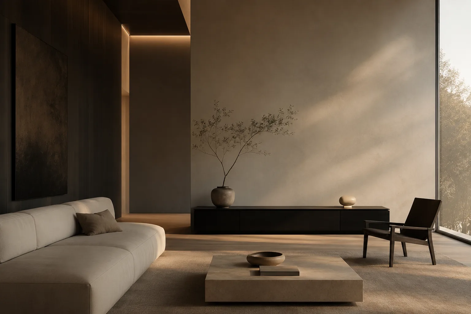
Luxury has never been loud. It has always been restraint.
Walk through a luxury hotel.
Drive a well-designed automobile.
Hold a beautifully crafted watch.
Visit a thoughtfully designed home.
The first thing you’ll notice is what isn’t demanding your attention.
Nothing is screaming for approval. Nothing is competing to be noticed. Everything simply feels… right.
That’s the paradox of great design. The more intentional it becomes, the less it asks to be admired.
It whispers.
In digital products, we’ve somehow drifted away from that idea. We’ve become obsessed with adding more — more gradients, more animations, more notifications, more features, more visual treatments competing for attention. Somewhere along the way, “good” became synonymous with “busy.”
But true luxury has never been loud.
Luxury has always been restraint.
The Loudest Room Is Rarely the Most Beautiful
There is a tendency in digital design to equate activity with quality.
If every button glows. If every interaction animates. If every section has another color, another icon, another effect.
Surely the experience must feel engaging.
Except it usually feels exhausting.
Imagine walking into a room where every person is trying to have the loudest conversation. Nobody gets heard.
Interfaces work the same way. When every element competes for attention, nothing becomes important.
Hierarchy disappears. Meaning disappears. Calm disappears.
Users may not know why they’re uncomfortable, but they feel it.
Great design isn’t about making everything noticeable. It’s about helping the right thing be noticed at exactly the right time.
That’s restraint.
Simplicity Isn’t the Absence of Work
One of the biggest misconceptions in design is that minimal interfaces require less effort.
The opposite is true.
Complexity is easy. Anyone can continue adding. Another button. Another feature. Another promotional banner. Another card. Another icon. Another explanation. Another border.
Removing something is much harder.
Because every element has a reason to exist. Every stakeholder wants one more feature. Every department wants visibility. Every executive wants another call to action.
Designers become editors.
Not because we enjoy saying no. Because every “yes” carries a cost.
Attention is finite. Clarity is fragile.
Restraint is difficult because it requires confidence. You have to trust that the essential thing is enough.
White Space Is Doing More Than You Think
People often describe white space as empty.
It isn’t. It’s one of the hardest-working elements in design.
White space creates rhythm. It establishes hierarchy. It provides breathing room. It communicates confidence.
Luxury brands have understood this for decades. They don’t try to fill every inch of a page. They allow products to breathe.
The silence surrounding an object often gives it more value than the object itself.
Digital products deserve the same respect. Spacing isn’t decoration. It’s communication.
When an interface feels calm, users think more clearly. They make better decisions. They trust the product more.
Not because of what was added. Because of what wasn’t.
Visual Confidence Doesn’t Need Validation
One of my favorite exercises during design reviews is asking a simple question.
“What happens if we remove this?”
Sometimes the answer is nothing.
If removing an element changes nothing, why is it there?
This isn’t about achieving minimalism for its own sake. It’s about eliminating dependency.
Great interfaces don’t rely on visual tricks to convince users they’re modern. They don’t need oversized shadows. Or oversized typography. Or animated gradients. Or unnecessary effects.
Visual confidence comes from proportion. From consistency. From restraint.
A perfectly aligned layout creates more trust than a dozen decorative flourishes ever will.
Typography Carries More Emotion Than Most Designers Realize
Before someone reads your words, they experience them.
Typography communicates personality long before content does. It can feel warm. Authoritative. Approachable. Sophisticated. Playful.
Luxury often reveals itself through typography more than anything else.
Not because the font is expensive. Because it has been chosen intentionally. The spacing feels considered. The hierarchy feels natural. The rhythm feels effortless.
Great typography never calls attention to itself. It simply makes reading feel inevitable.
That’s remarkable craftsmanship.
Every Pixel Should Have a Job
I believe every visual element should be able to answer one question.
“Why am I here?”
If it cannot answer, it probably shouldn’t exist.
Buttons exist to invite action. Color exists to establish hierarchy. Motion exists to reinforce understanding. Photography exists to create emotion. Icons exist to simplify recognition.
When elements begin performing multiple unrelated jobs, interfaces become confusing.
Purpose creates clarity. Decoration without purpose creates noise.
Good design doesn’t eliminate beauty. It ensures beauty has meaning.
Premium Doesn’t Mean Expensive
One of the most interesting things about digital products is that premium experiences rarely come from expensive visuals.
They come from thoughtful decisions.
Consistent spacing. Predictable interactions. Readable typography. Balanced layouts. Carefully chosen imagery. Fast loading pages. Thoughtful microcopy. Small details repeated consistently.
Luxury isn’t created through extravagance. It’s created through precision.
Anyone can spend money. Very few people spend attention.
The latter matters more.
Designing for Calm
Every product competes for attention. Very few compete to give attention back.
Imagine software that never interrupted unnecessarily. Notifications that respected your time. Interfaces that guided instead of demanded. Interactions that felt obvious rather than clever.
That kind of product immediately feels different.
Not because it’s louder. Because it’s quieter.
There’s a growing appreciation for products that reduce cognitive load rather than increase it. Design has an opportunity to become restorative. Not simply functional.
Calm isn’t boring. Calm is confidence.
Trends Fade. Taste Endures.
Every year design trends arrive. Glassmorphism. Neumorphism. Brutalism. Hyper-gradients. Oversized interfaces. Micro-interactions.
Some are useful. Some disappear almost immediately.
Good designers pay attention to trends. Great designers understand principles.
Balance. Contrast. Hierarchy. Rhythm. Scale. Alignment. Proportion.
These ideas existed long before digital products. They’ll remain relevant long after today’s visual trends disappear.
Craft ages better than novelty.
That’s why some interfaces still feel timeless years after launch. They weren’t designed for today. They were designed around human perception.
The Most Memorable Experiences Often Go Unnoticed
Some of my favorite products aren’t memorable because they surprised me. They’re memorable because they never interrupted me.
They disappeared. The interface stepped aside. The experience became effortless.
That’s the highest compliment a designer can receive.
Not “That animation was amazing.” Not “What software did you use?”
Simply… “I never had to think about it.”
Design has succeeded when users focus on their goals instead of your interface.
Ironically, the better we become at our craft, the less visible our work often becomes.
Why Restraint Matters More Than Ever
We live in a world saturated with noise. Notifications compete for attention. Ads compete for attention. Social platforms compete for attention. Even software competes for attention.
Good design has an opportunity to become something different. A quiet place. A trustworthy guide. A calm experience.
Luxury is no longer defined by excess. It’s increasingly defined by clarity. By confidence. By removing friction instead of adding spectacle. By allowing people to focus on what actually matters.
That philosophy influences every project we build at Artifact Digital. Not because minimalism is fashionable. Because thoughtful restraint creates experiences that last.
The best products don’t leave users impressed by the interface. They leave them empowered by what they accomplished.
That’s the kind of design worth pursuing.
Because good design whispers. And great design never needs to shout.