
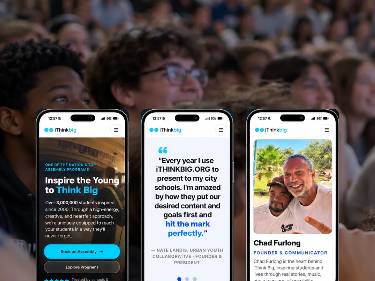
iThink Big
A live assembly program translated into a site that moves like the show and books like a business.
UX/UI design is the difference between software that works and software people actually want to use: structure clear enough to be effortless, interaction that feels considered, and a visual signature distinctive enough to be yours.
There's a false choice in our field between design that works and design that's beautiful, as if you have to trade one for the other. We don't accept the tradeoff. A checkout that's a joy to look at but loses people isn't good design. Neither is a workflow that functions but feels like filling out a tax form. The work is to get both, and getting both is hard, which is exactly why it matters.
UX and UI aren't two departments to us. UX is the structure — the flows, the hierarchy, the logic of how a thing is organized. UI is the surface — the type, the color, the space, the motion. Great software gets both right, and gets them right together, because a beautiful surface on a broken structure is lipstick, and a sound structure with a lifeless surface is a wireframe someone forgot to finish.
We care about the details other people skip: the empty state, the error message, the loading moment, the transition between two screens. Those details are where software either feels considered or feels cheap, and people register the difference instantly even when they can't name it.
We design the bones before the skin. Information architecture, task flows, and content hierarchy come first, because no amount of visual polish fixes a screen that's organized around the wrong priorities. Once the structure holds up, the visual design has something true to make beautiful.
This order also keeps us honest. It's easy to fall in love with a gorgeous mockup that quietly assumes the happy path and ignores the real complexity. Designing structure first forces the hard cases into the open early, when they're cheap to solve.
AI can now produce a competent interface in minutes. That's genuinely useful, and it changes where the value is. When almost anyone can generate something that works, the difference between products comes down to judgment: what to leave out, what deserves emphasis, how a change of state should feel, whether the software sounds and looks like your company.
That judgment is what our team has spent decades developing — hierarchy, interaction, typography, accessibility, restraint, and an understanding of how people actually behave. We use AI to explore more directions than a design team once could. The decisions that make software worth using stay with experienced designers.
A lot of modern software looks the same — the same components, the same gradients, the same rounded rectangles. That sameness is a missed opportunity. Your product is a chance to feel like you and no one else, and a distinctive visual voice is a real competitive asset, not a vanity.
We build that signature deliberately: a type system with a point of view, a considered use of color and space, and a brand carried into the product rather than left on the marketing site. Motion follows the same rule. Used well, a transition guides attention and explains change; used carelessly, it's friction dressed up as delight. We design it to clarify.
Every Artifact engagement runs on one method: Understand → Design → Build → Launch → Grow. These are the stages where UX/UI Design does the most work. See how we work.
Structure comes first: flows, information architecture and hierarchy resolved around what people are actually trying to do.
The visual and interaction language gets established in prototypes you can use, not static comps you can only review.
Real screens — empty states, errors and edge cases included — designed alongside engineering and turned into a reusable component system.
A live assembly program translated into a site that moves like the show and books like a business.
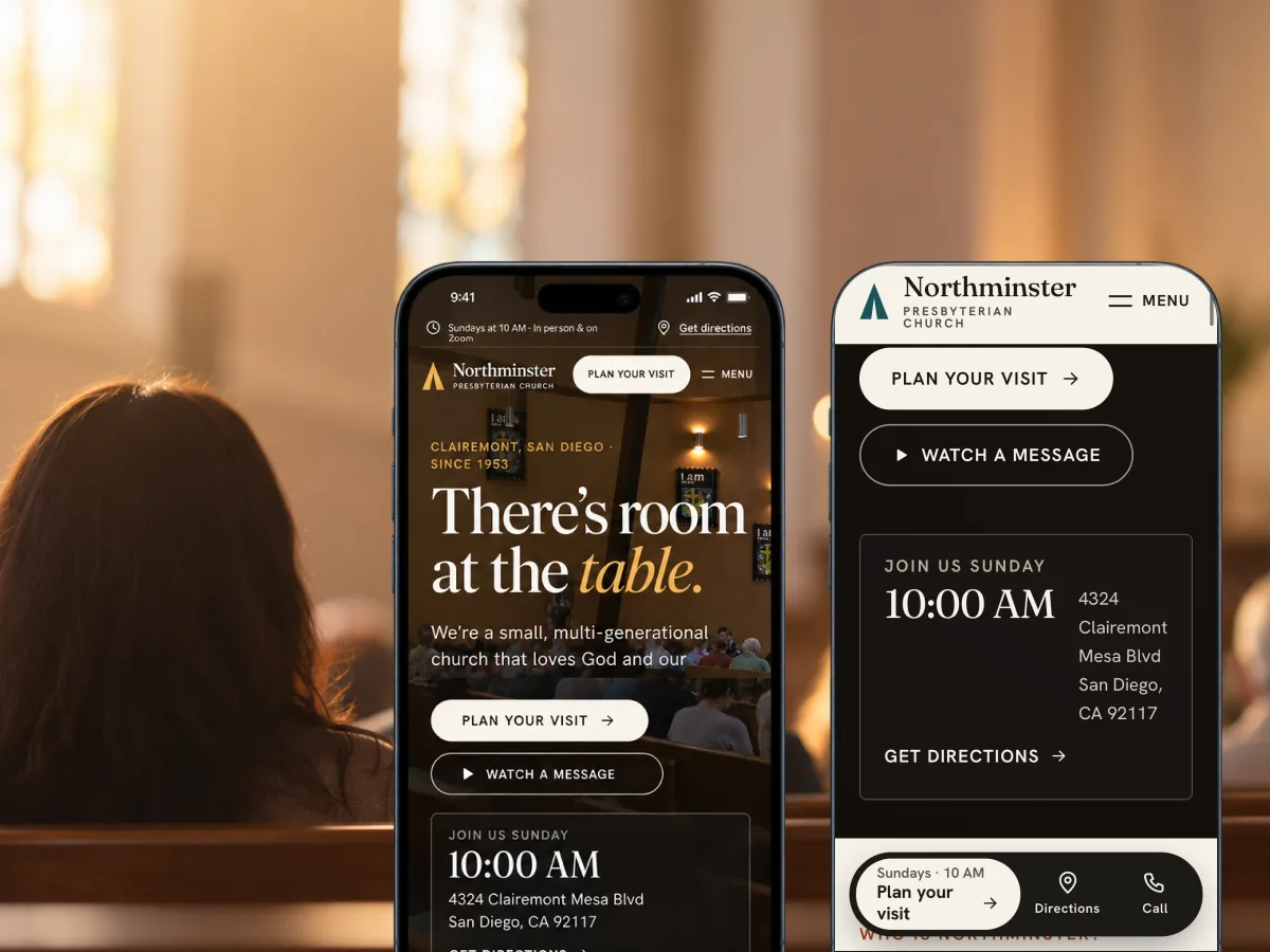
A neighborhood church in Clairemont since 1953, rebuilt around the question a newcomer actually has: what happens if I show up?
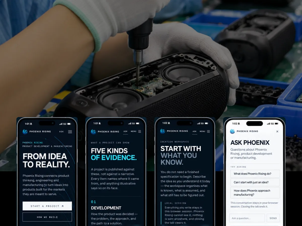
Years of manufacturing relationships across two continents, turned into a digital front door that earns trust before the first call.
Tell us the problem. We'll tell you honestly whether software is the answer — and bring the strategy, design, engineering and AI to build it.