
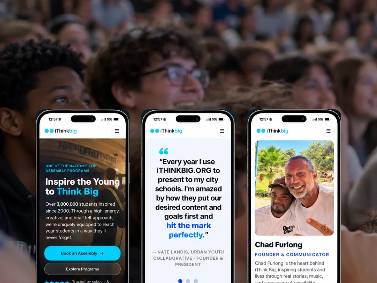
iThink Big
A live assembly program translated into a site that moves like the show and books like a business.
Product design is how we turn complex business workflows into software people understand and want to use — and keep it that way, release after release, as the product and the stakes grow.
Marketing sites and products are different animals, and treating them the same is a common, expensive mistake. A marketing site makes a first impression; a product has to hold up on the ten-thousandth use. A site can lean on a beautiful moment; a product has to survive edge cases, permissions, error states, data that's messier than the demo, and users who are tired and in a hurry.
Product design is the practice of keeping software clear as it accumulates complexity. Every product tends toward entropy — more features, more settings, more special cases — and without deliberate design, that complexity leaks straight onto the user. The job is to absorb it: to make a genuinely complex system feel obvious to the person who just needs to get something done.
This is especially unforgiving in the software people use for work — SaaS platforms, dashboards, internal tools, anything operational. These aren't casual experiences; they're where someone spends their day. Small frictions compound into real cost, and clarity isn't a nicety, it's productivity.
You can't design a real product screen by screen, because the screens have to add up to something coherent, and users move between them constantly. So we design the system underneath — the patterns, the components, the rules for how things behave — and let the individual screens fall out of it consistently.
This is what makes a product feel considered rather than assembled by committee. When navigation, states, and interactions follow a consistent logic, users learn the product once and apply that learning everywhere. When they don't, every screen is a small new puzzle, and the product feels harder than it is.
Anyone can make a simple thing look simple. The craft is making a complex thing feel simple — a dashboard dense with data that still reads at a glance, a workflow with a dozen states that never leaves the user lost. That's the work we're built for.
It comes from ruthless prioritization on every screen: what is this view actually for, what's the one thing the user came to do, and how does everything else get out of the way without disappearing when it's needed? Answered honestly, screen after screen, that question is what keeps a growing product usable.
We prove product design with real users doing real tasks under realistic complexity — not a demo that only works on the happy path. And because the same team builds the software, front end and back end, our designs are grounded in what's actually buildable, right down to the data model.
Keeping research, design and engineering close together is what keeps a growing product clear. It's also how the details survive the trip from prototype to production instead of getting lost in a handoff.
Every Artifact engagement runs on one method: Understand → Design → Build → Launch → Grow. These are the stages where Product Design does the most work. See how we work.
We learn the real jobs, data and conditions the software will operate under — permissions, edge cases, messy data and tired users included.
We establish the system of patterns first, then prove the flows with working prototypes under realistic complexity.
Designers stay in the build loop, so states, details and intent survive to production instead of getting lost in a handoff.
The design system keeps the product clear release after release, as features and scale accumulate.
A live assembly program translated into a site that moves like the show and books like a business.
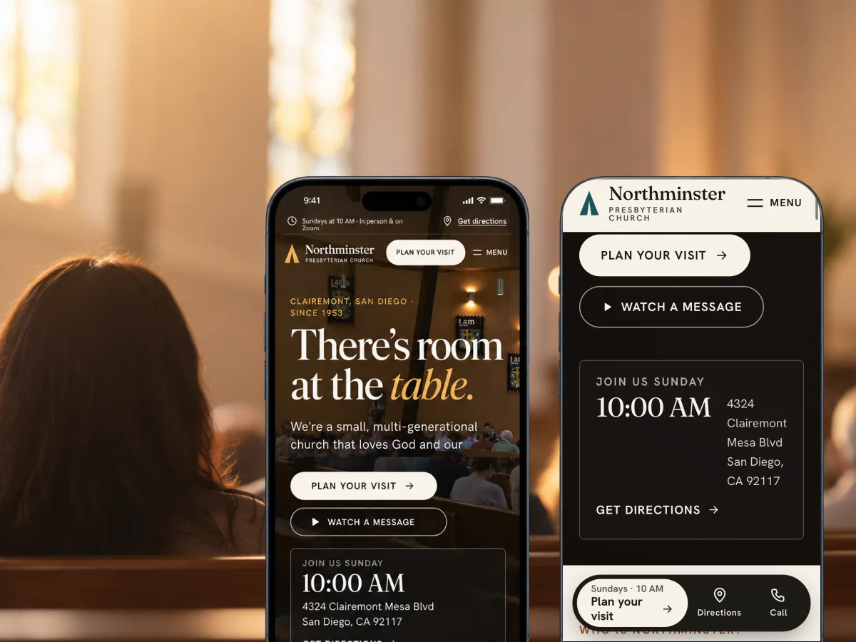
A neighborhood church in Clairemont since 1953, rebuilt around the question a newcomer actually has: what happens if I show up?
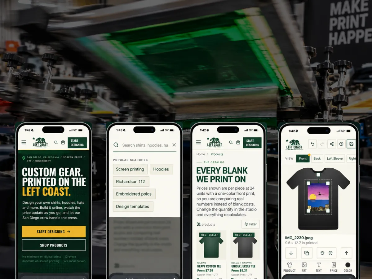
A print shop site where customers place their own artwork on the garment — and the order arrives ready to produce.
Tell us the problem. We'll tell you honestly whether software is the answer — and bring the strategy, design, engineering and AI to build it.