Back to work

Built by Artifact · Live

Case study · Website

Nobody’s first questionis theological.

Northminster is a small Presbyterian church in Clairemont — about sixty people on a Sunday, in the same tented sanctuary they broke ground on in the sixties. The website’s job isn’t to explain a denomination. It’s to get a stranger from “maybe” to a seat.

Client
Northminster Presbyterian Church
Year
2026
Scope
Strategy · Design · Build
Status
Live · northminsterclairmont.org

See it live — northminsterclairmont.org ↗

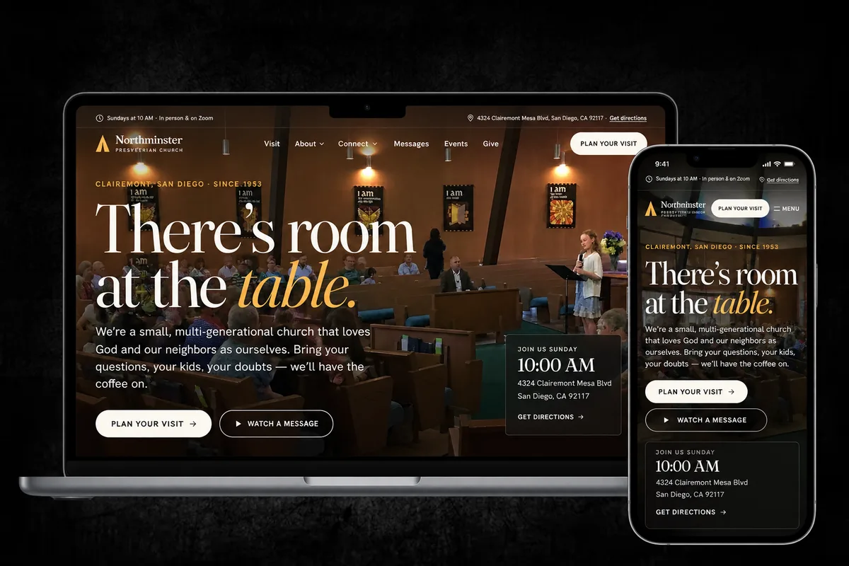
Four phone screens from the Northminster site — the hero, plan your visit, the leadership page and the menu — over a Sunday service in the sanctuary.

How most people meet the church: on a phone, about a room they haven’t walked into yet.

A church website gets read by someone standing outside.

01

The real questions are logistical

When does it start, how long is it, where do I park, what happens to my kids, will I be the only one who doesn’t know anyone. A site organised around ministries and committees answers none of that — and those are the questions that decide whether someone comes.

02

Sixty people and no web team

A congregation this size has no communications staff. The structure has to stay right when nobody is tending it, and adding a sermon or an event can’t require a developer.

03

The decision happens on a phone

Someone looks up a church on a Saturday night, or at eight on a Sunday morning in their kitchen. A site that makes them hunt for the service time is answering the wrong question slowly.

The site isn’t about the church.It’s the first five minutes of a visit.

So the newcomer’s three facts lead everywhere: the service time and address in the header, “Plan your visit” following down the page, and a bar pinned to the bottom of every phone screen with the hour, directions and a number that dials. The visit page answers the unglamorous things — one service, about an hour, kids from three through sixth grade, coffee before and after.

The photography is theirs, not stock: their kitchen on a Wednesday night, their garden, their sanctuary. And the church is marked up as a place with a weekly service schedule, so a search for a church nearby gets back the right hour and the right address.

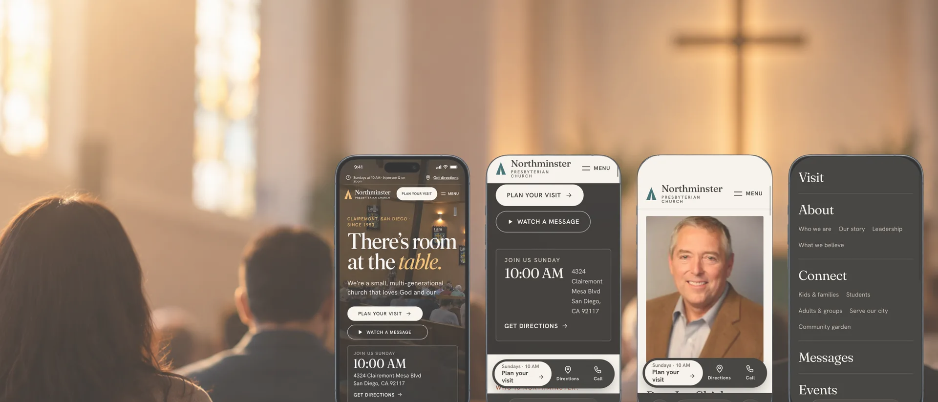
The Northminster homepage on a laptop and a phone: “There’s room at the table.”
The same three facts lead on every screen: when, where, and what to do next.

What it delivered.

  • 01

    The answer before the ask

    Service time, address and directions in the header, in the footer, and pinned to the bottom of every phone screen with a tap-to-call number.

  • 02

    Written for a first Sunday

    A visit page about the hour itself — how long it runs, where the kids go, what the music is like — rather than a statement of beliefs.

  • 03

    Their own faces

    The congregation’s photographs throughout: the Wednesday night kitchen, the community garden, the sanctuary, the people who fill them.

  • 04

    Findable on a Sunday morning

    Marked up as a church with a service schedule and a mapped location, so local search can return the right hour and address.

  • 05

    Light enough for a small church

    A static build with the stylesheet inlined and every photograph generated at six sizes, so it stays quick on a phone with one bar of signal.

Need a site that does the welcoming for you?

Start a Project